Entries Tagged as: blogs
Wild and Wacky Nature Printing
May 19th, 2009, Comments (5)
There are so many ways to play with nature elements in your art. If you're looking for some inspiration, here are some fabulous tutorials to get you started:
- Hammered flower and leaf prints: Super clever way to get the color of flowers and leaves into your art while simultaneously pounding out your frustrations. (I should have done this after the Celtics game on Sunday. Blarg!)
- Gyotaku: We all know about leaf rubbings, but what about fish rubbings? This tutorial will walk you through the finer points of Gyotaku. My cats would go out of their minds if I ever did this at home, so I won't be doing this anytime soon!
- Leaf Rubbings: For a different look with botanical rubbings, try doing them on rice paper. I love the way they look in this Martha Stewart calendar and I bet they'd look gorgeous incorportated into a collage.
- Gelatin Printing: I've done some gelatin printing before and it's a blast! It's also a great tool to use with natural elements to make gorgeous monoprints. Here's a tutorial on setting up your own gelatin printing station: This one is from Art Esprit and here are written instructions along with a video from Linda Germain (check out all her gelatin printing videos on youtube!)
I did all the images in this post with gelatin printing. They're fun to make and they're also great to use as collage materials.
Hopefully this will fill your head with ideas and send you off to buy gelatin. Or maybe it will just inspire you to hammer the heck out of some plants. Or perhaps you'll paint a fish. Hehe. This post could get you into trouble! No matter what, keep having fun with it!
Creating Space for Creativity
May 7th, 2009, Comments (10)
Yesterday I took an Office Spa Day class with the super sweet, Jennifer Hofmann. This year I've done a lot of clutter clearing in my office/studio space and it's felt fabulous to unload so much. It's amazing to me how much clearing my physical space clears my mental space as well.
Ophelia
A few months ago, I spent a couple weeks doing a half-hour of clutter clearing every day. That worked well for awhile, but after I'd reached my goal of doing it for 2 weeks, I was ready for a break. The major advantage of doing clutter clearing at a regular time every day is that it takes the planning out of it. I just knew that at 11 am every day, I was going to spend 30 minutes doing this clutter clearing business and then it would be over. Small chunks of time is good. Planning a specific time is also good. But did I want to be doing that forever? No. So, I went back to occasional clutter clearing and maintenance and that was working fine for me, until I noticed that there were a couple areas I was avoiding. Sticky spots.
One of those spots was behind my office door. I keep my office/studio door open most of the time, so it provided this not-so-secret clutter hiding spot. And it was growing. The dust bunnies, an old Reebok step, two yoga mats, some old picture frames, a bunch of free cloth bags I got at various events, a dress....Oh, and did I mention the dust bunnies? Yeah, they were multiplying like crazy. Doesn't seem like a big deal perhaps, after all it was out of sight 90% of the time, but it was weighing on me. I knew it was there and it was also expanding to the point where I couldn't open the door all the way. At the rate it was going, there was soon going to be enough stuff "hidden" back there that I wasn't going to be able to open the door at all. Ack!
So, I'm learning when to ask for help and I knew that scheduling the time for an Office Spa Day (a fun, gentle way to clear some clutter in your space) would do the trick. Jennifer asks some excellent questions when it comes to clearing clutter including, "Does this (fill in your clutter item here) support who I am and where I'm going?" Asking this sort of question helps make it so much more clear and easy to get rid of the stuff that I've been unsure about what to do with.
I spent an hour cleaning out the space behind my door, getting rid of some crap behind my bookcase, and clearing off my inspiration board. And lo and behold, I can now open my office door. I immediately felt a sense of openness, both literally (the door can open all the way, yay!) and emotionally.
So, what does this have to do with creativity? Well, clearing space on occassion helps make room for new things to bloom, whether in your business, in your mind, or in your art. Physical space relates so much to our mental space. I find this happens with selling my art too. Even though I sometimes get a little sad when I sell a piece of art, I simultaneously love helping to brighten someone else's space with art and when I move art of my space, it helps make room for new art to be created. It has something to do with flow, keeping things moving, feeling expansiveness, openness, and room for possibility.
When you look around your creative space, do you see things that do not support you in you and your creativity? Try removing (tossing, storing, giving away) just a few things and see how it makes you feel. What might it open up for you?
More clutter-clearing resources:
- - Alison Marks, Inside Out Design Coaching: Alison has a great process for helping you get clear on the qualities you want in your home.
- - Lisa Baldwin, Divine Order: Also a total sweetheart, Lisa is a Clutter Coach who also teaches a fabulous de-cluttering e-course.
- - Shannon Wilkinson: A life coach, who I totally adore, teaches a DeClutter Happy Hour!
- - Sunny Schlenger: Life coach and author of Organizing for the Spirit, a great de-cluttering resource.
Wow, looking over this list I'm realizing that I must have a thing for de-cluttering specialists! Ha! I think it's because all these ladies have a super sweet, gentle way of approaching something that's especially sticky for me. Go check out what they have to offer and make some room for the creativity that's waiting to bloom.
Artful Blogging Magazine
May 1st, 2009, Comments (42)
Yay! I'm so thrilled to say that I've got two articles in the the Summer edition of Artful Blogging Magazine which is available online or stores like your local Barnes & Noble today.
Since I first saw this publication, I hoped to someday be featured in their pages. It's simply gorgeous, full of color and inspiration and loads of great blogs to check out.
And now, here it is. So wonderful to see a goal materialize. You can see one of my paintings (Dreaming of the Seven Sisters) in the lower right corner of the cover.
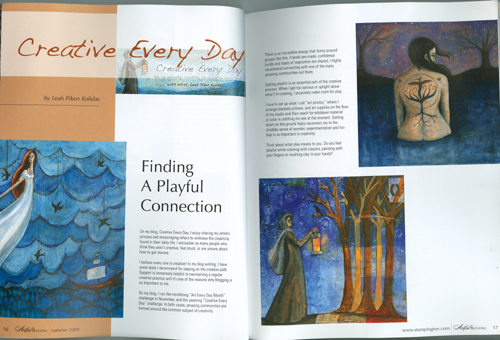
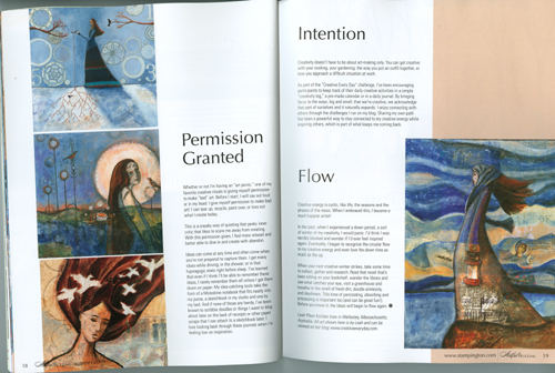
The first article consist of an article from me about being Creative Every Day, illustrated with my art along with a partial blog post and the second is an interview with me about the Creative Every Day Challenge, illustrated with the art of Creative Every Day Challenge participants! Here are the first two spreads of my article.
And here are the spreads from the interview with me about the Creative Every Day Challenge which features the art of Creative Every Day participants. (I asked for some submissions before the article came out and the magazine editors chose from among them.)
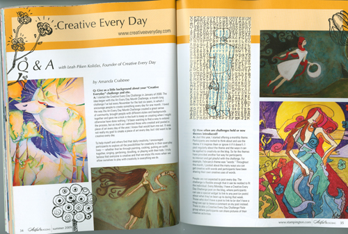
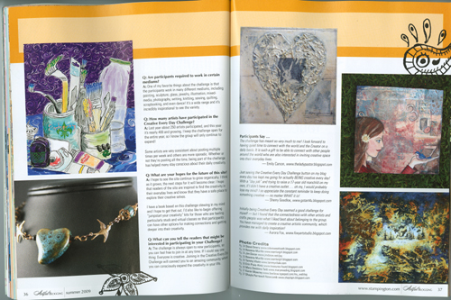
The artists featured are Steve Emery, Rowena Murillo, Jim Doran, Tammy Vitale, Erin Prais-Hintz, Mary Stebbins Taitt, Karen Mowrey, and Shayla Perreault Newcomb. And there are also quotes from Emily Carson, Sherry Goodloe, and Aurora Fox! Thank you to all of you for sharing your art and words to help make my interview with Artful Blogging so special!! It means the world to me and wowzers, your work looks amazing on the glossy pages! I wish we could have featured all the CED participants, but that would take an encyclopedia!
And thank you to all the readers of this blog and all the participants of Creative Every Day for making this space so safe and so special. You all inspire me and have helped me grow as a person and an artist. I am eternally grateful.
Wishing you a wonderfully creative weekend!
p.s. We have entered the month of May and the totally optional theme is Nature! I've got lots of ideas about how to explore this theme and I look forward to seeing what you'll do with it!
p.p.s. Be sure to join in Jamie's Virtual Dance party today!!
Color Psychology
April 29th, 2009, Comments (7)
Fishing
I couldn't end this month of color without devoting a bit of time to color psychology. It's not something I've studied all that much, but I always find it interesting to explore.
When you're thinking about what colors mean to you, I think it's worth it to do some exploration through journaling or art-making to discover what your own associations with color are. But if you want to explore what people in general feel about color, what affect colors have on the viewer, studying color psychology is a great way to dive in.
I don't think much about how the colors I chose for my art might affect my viewer, but I'm pleased to see that blues (which I use a lot of in my art) are calming and aid in intuition! I think part of my love of blue has to do with my love of water.
For more info on color psychology, Kate Smith has a great Squidoo page on the subject with links to loads of great articles she's posted in her website, Sensational Color and blog, Live in Full Color (so much delicious inspiration!)
What about how color influences what we buy? People interested in brand development or store (online or in person) design certainly keep this in mind. But it's also interesting to consider when setting up our own online shops and blogs. Here's a quick article on how color impacts the buyer and another on color psychology in marketing. I've read in a few different places that people are not fond of orange. But I like it.
This is just a jumping off point if you want to explore the subject more. I'm curious about what your associations with colors are. What are your favorite and least favorite colors and how do they make you feel? What memories do these colors hold for you? What happens when you create with colors that you love and colors that you avoid?
p.s. Remember that the 20% off coupon for my art shop is only valid through the end of the month! Type in springsale09 in the coupon code at checkout.
-Check out the the great list of "Online Communities to Liberate Your Closet Creative" at BitchBuzz! Creative Every Day is mentioned as is my pal, Jamie Ridler!
-Speaking of Jamie, be sure to check out her 4th Annual Shyne Like a Star Virtual Dance Party this Friday! Woohoo! I'll be joining in!
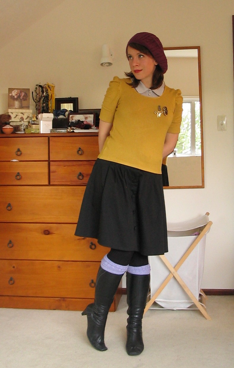
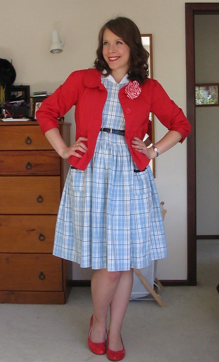
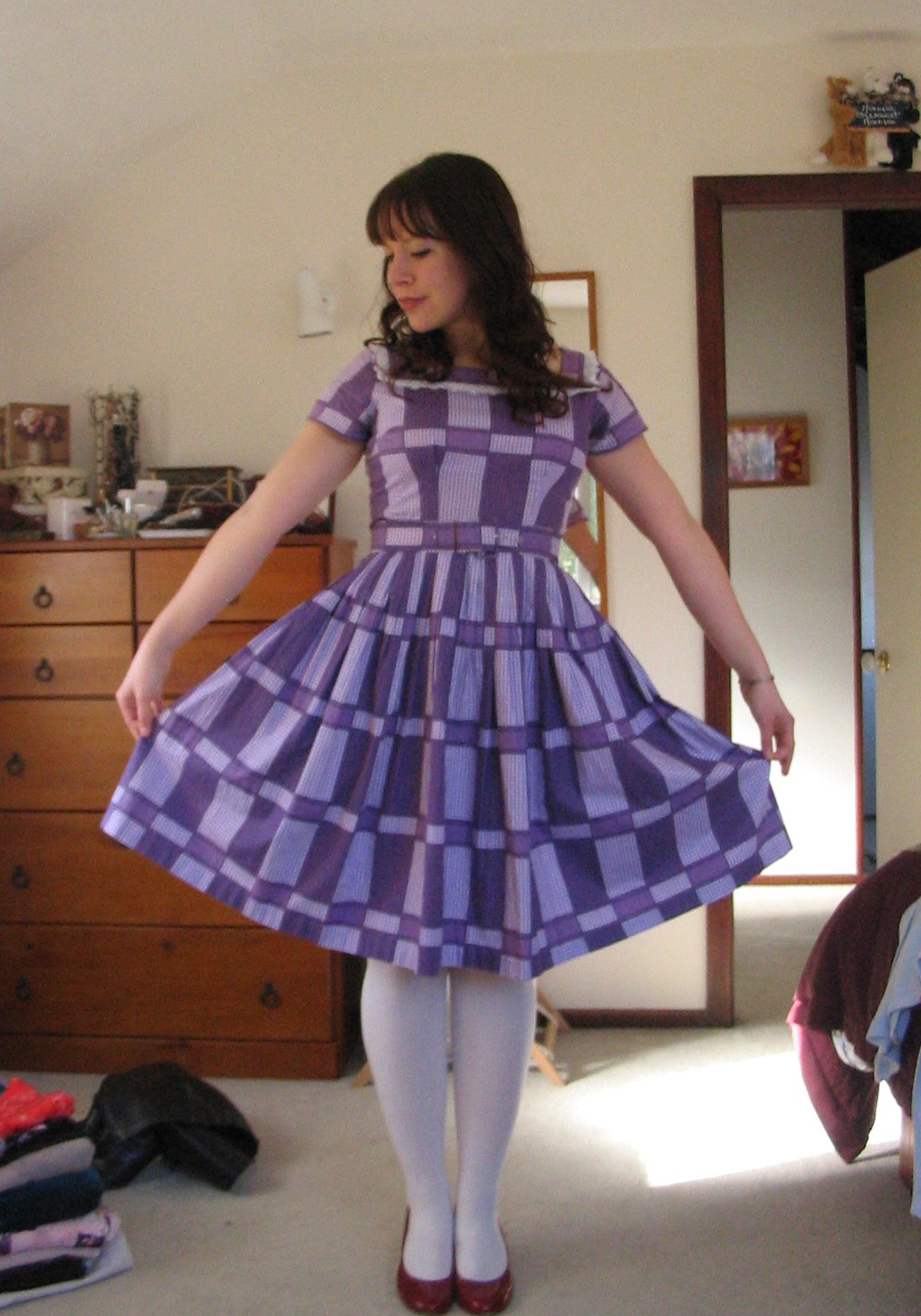
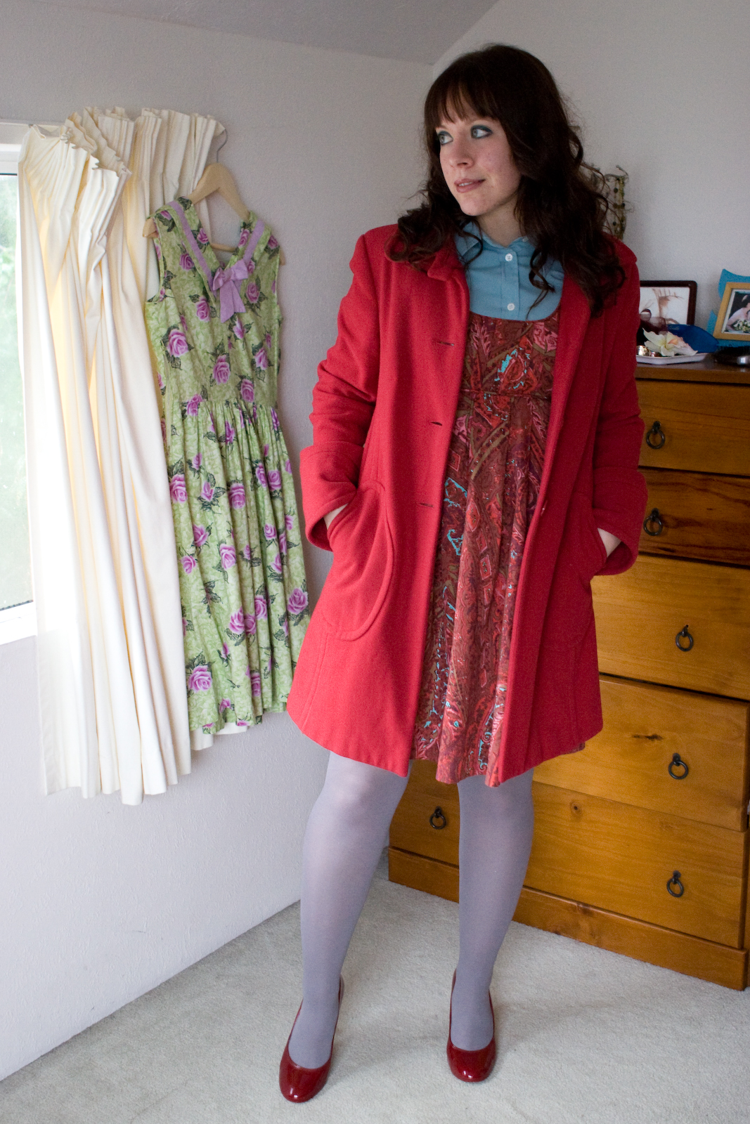
Fashion and Color (or Colour): Interview with Andrea
April 28th, 2009, Comments (10)
For the month of color, I really wanted to interview my blogging pal, Andrea, of a cat of impossible colour. Andrea is a fabulous writer, but much of her blog is dedicated to her gorgeous outfits, combining beautiful colors, patterns, and vintage fun.
I hope this interview inspires you to play with color in a new way!
L: First, please tell us a bit about yourself:
A: My name is Andrea, and I’m a Zimbabwean writer now living in New Zealand with my husband and cat. I have a blog where I indulge my hobby of collecting vintage clothing, post daily outfits and record the progress of my books!
L: What do you enjoy most about putting together your outfits?
A: Well, I see getting dressed in the morning as a creative exercise, just as much as painting a picture or writing a poem, and putting together an outfit I’m happy with gets me in a great mood for creation of other kinds! If I’m wearing something I really love, I feel like my writing goes better that day as well.
L: How does color inspire you creatively?
A: To me, colour represents emotional energy. That sounds a bit pretentious, doesn’t it, but all I mean is that each colour comes with its own set of emotional associations. Colour is food for your eyes, and it can transform or dictate your mood. I have always felt a connection to this passage from George Eliot’s Middlemarch, where Dorothea Brooke is entranced by colour:
‘She was opening some ring-boxes, which disclosed a fine emerald with diamonds, and just then the sun passing beyond a cloud sent a bright gleam over the table. “How very beautiful these gems are!” said Dorothea, under a new current of feeling, as sudden as the gleam. “It is strange how deeply colours seem to penetrate one, like scent. I suppose that is the reason why gems are used as spiritual emblems in the Revelation of St John. They look like fragments of heaven.” … She thought of often having them by her, to feed her eye at these little fountains of pure colour.’
L: Do you have a favorite color combination at the moment?
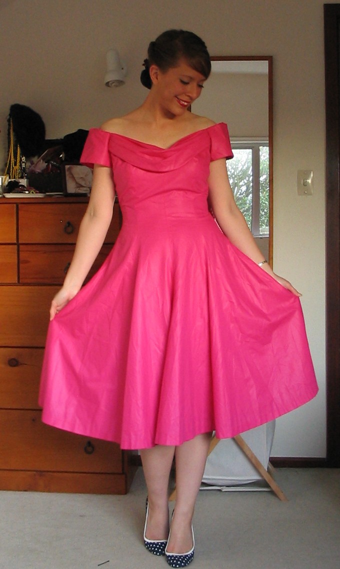
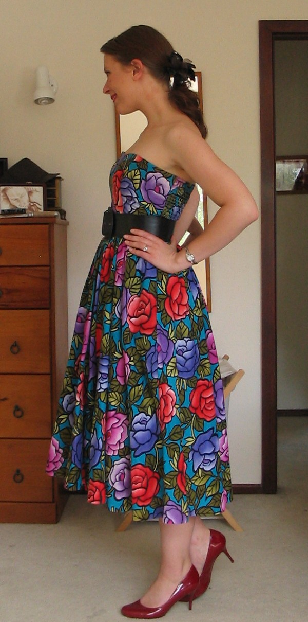
A: I tend to favour colours that are complementary – that is, hues that are opposite each other on the colour wheel. Purple with yellow and green with red (in moderation, because it can be a bit Christmassy) are favourite combinations. I also love red and blue together. In fact, red with almost everything looks great, so long as you choose the right shade – I wear red shoes and belts with everything from yellow to purple.
L: Where do you get your inspiration?
A: I get a lot of inspiration from other bloggers, and from the wardrobe_remix group on Flickr. I don’t read a lot of fashion magazines – I’d rather see what real people are wearing in real daily situations.
L: Do the colors in nature inspire your outfits at all?
A: They do, but not in the way you would expect! I grew up in Zimbabwe, which was a very colourful place – blue sky, golden bush, bright birds and flowers, the gorgeous multi-coloured clothes of the Shona people and the city markets full of fruit and fabrics. When I first came to New Zealand, the landscape seemed pale and colourless in comparison. Now I can appreciate the subtler beauties of a grey sky and autumn leaves, but I still crave the bright, jewel-like colours of Africa. So I compensate with my outfits! People here tend to wear a lot of denim, grey and black, and they blend into the landscape. I would rather add a bright splash of colour.
L: What would you say to someone who is wanting to start playing more with their own ensembles?
A: I would say to be brave and experiment. If you’re not a big colour-wearer, start with accessories – I wear my red heels to death, and they go with nearly everything. I’ve also recently become a big fan of coloured tights – they’re a wonderful way to inject colour into an outfit, although the lighter shades can make your legs look bigger (if you’re like me and don’t have long, skinny legs!). If you’re not sure about colour combinations, the girls at Academichic have done a wonderful series of posts on colour theory and how it applies to dressing.
Scarves are the perfect way to add colour to outfits, as well, and there are so many ways to wear them: over your hair, around the handle of your handbag, as a belt, or, of course, around your neck. They always make an outfit look chic. My favourite way to wear scarves is to tie them in a pussy bow around my neck. Lately I have started wearing big square scarves tied over my hair and under my chin when I go for walks – it’s a great alternative to wearing a hat.
I think it’s important to have fun with your clothes. When I’m having a blah day and feel like hiding away in something grey or black, I resist the urge and throw on something brightly-coloured instead. It always makes me feel better.
L: Do you have a favorite color? Is it the same color as when you were a kid?
A: When I was a kid I always said my favourite colour was blue when asked, because that was the only ‘cool’ colour in my class and we all pretended to love it! In reality, though, it has always been red. I find red strong, energising and optimistic, and I always feel good when I’m wearing it. Purple, green and yellow are also favourites. I think the only colour I don’t wear is orange, but that may all change if I find some wonderful orange item next time I go thrift-shopping.
L: Did you have a favorite outfit as a child?
A: I was a huge tomboy when I was a child, and didn’t bother much with clothes. Looking back at old photos, though, I can see I was a big fan of dungarees, colourful T-shirts and socks with cartoon animals on them. I’m still hoping to find a wonderful grown-up-sized pair of dungarees one day! (And I still wear cartoon animal socks).
L: What are some of your favorite books, blogs, shops, websites?
A: I find old children’s books very inspirational when it comes to outfits; Alice in Wonderland, The Secret Garden, Milly Molly Mandy, the Enid Blyton books and Madeleine have all inspired outfits of mine. There’s a charm to the way children used to dress, I think. I find old films very inspirational, too. As far as websites go, I love Orla Kiely’s clothes! The mixture of colours and prints is just gorgeous. I also love browsing through Andrea Moore’s website – she’s a New Zealand designer, and I’ll probably never be able to afford anything she makes, but her garments are just lovely.
I only shop second-hand, which makes for a good deal of experimenting! If I find an amazing dress in a colour I would not normally seek out, I buy and wear it anyway. It’s a great way to be more adventurous with your clothing and colour choices – after all, if it doesn’t suit you and you don’t want to keep it, you have only wasted a few dollars.
I have many, many favourite fashion blogs, as evidenced by my bulging blogroll. I’m drawn to people who have colourful, optimistic styles. Some that I think have a particularly inspirational use of colour are:
- Keiko Lynn
- Casey’s Musings
- Dotti’s Dots
- Strawberry Kitten
Thank you so much, Andrea!! I'm feeling inspired!
Spring Sale and Lovely Linkage
April 23rd, 2009, Comments (10)
Special Discount! On May 1st I will be raising prices on my framed prints and original artwork in my online shop, Blue Tree Art Gallery. I let my newsletter subscribers know a few weeks ago and gave them a coupon for 20% off any purchase through May 1st. (You can sign up for my art newsletter here and be entered into a monthly drawing for a free print! Sign up form is in the lower left corner.)
Well, I really wanted to extend a special thank you to my readers here, so I'm going to share the coupon code here too. Feel free to use it for 20% off anything in my art store from now until May 1st. If you've been thinking about grabbing something, now's the time to do it before I bump the prices up!
Here's the code! springsale09
Feel free to share the coupon or pass on a link to this post!!

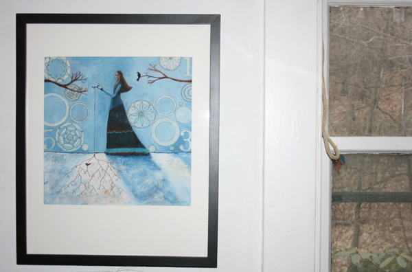
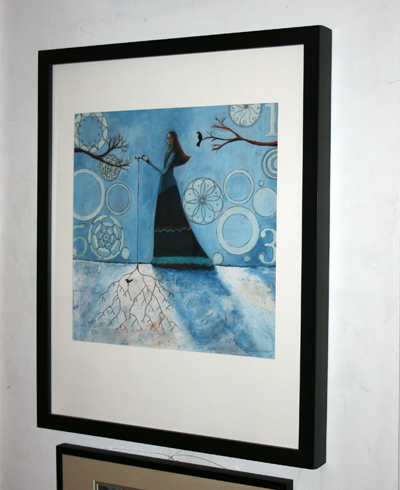
Framed prints (in a 16"x20" wooden frame) are currently $100 and with the coupon code they're only $80! Total steal. Above, you can check out a couple examples of what a couple freshly framed prints look like. (Prints pictured above: Bring Love and Lighthouse.) And below, here's one of my newer prints, Key to Winter, framed and hanging on my studio wall.
Lovely Linkage
O.k., I've also got this build up of fabulous stuff to share, so let's just get to it, shall we?
*Rebecca at Difference a Year Makes posted a video of artist, Jonas Gerard that is so fabulous I just had to share it with you. I've seen his videos before and loved the joy with which he works, but I think his style also is a fabulous illustration of the kind of intuitive painting I'm doing in the class I'm taking and it also reminds me of the methods I use in the Art Picnic class. It's all about permission, freedom, and connecting with your intuition. And I also loves how it ties in with the color theme this month, both in how rich and gorgeous his use of color is and also in how he talks about how he chooses his colors and how colors each have their own "vibe." So true! So, do check it out and enjoy the music that goes along with it. And if you're interested in seeing more of Gerard's videos head over here.
* Sometime around the New Year, I stumbled upon the blog of Havi Brooks and quickly became a huge fan of her work. Her writing is honest, deep, and yet accessible. I love how she teaches about both the hard (business biggifying) and the soft (working on your patterns.) She combines this kind of work in a way that really resonates for me. Check out her blog and then check out all the fabulous resouces she offers on her site.
In a couple weeks Havi is teaching a class on how to get fantabulous testimonials without feeling icky about it. I'm going to be taking it! Check out all the details and sign up here.
* This Rounded Corner tool is super handy for making your images all rounded and purty!
* I'm so loving Brene Brown's read through of her book I Thought It Was Just Me (but it isn't). She's been doing a weekly podcast around the topic of shame with loads of great links and projects. Very powerful stuff.
* Celebrating crafting failures, the blog CraftFail cracked me up and made me feel a whole lot better about my many crafting blunders.
* The super sweet, Kathryn Antyr (Collage Diva) has a fabulous new blog called True North, which explores finding your direction through art-making. Love it! She's created a really cool Personal Map Making contest with loads of cool prizes. Check out all the details here.
* Janice at Postcards from Wildwood has posted a fantastic Photoshop tutorial that fits so well with the color theme.
Oh, there are so many treasures to explore, but that's probably more than enough for one day! So, enjoy and have a beautifully creative day.
Drinking up Color Online and Offline
April 15th, 2009, Comments (14)
Yum. Something about color is so delicious to me right now. I'm just drinking it up. Between the Intuitive Painting class I'm taking, the fact that Spring is finally happening here in New England, and this month's theme for the Creative Every Day Challenge, I'm all about color.
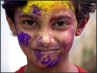
One of Sukanto Debnath's photos of Holi, Festival of Color
If you're in need of a shot of color, get yourself over to the Colour Lovers blog. They have fabulous articles with stunning pictures sure to inpire you. I'm loving this one about Holi, the Hindu Festival of Color that happens in March, and this one about the colorful art of Thangkas.
Speaking of Thangkas, I had the pleasure of meeting Leslie Rinchen-Wongmo at a Christine Kane retreat last month and she makes absolutely amazing pieces of textile art working in a Tibetan tradion. Her fabric thangkas are sacred Buddhist images created in layered, hand-stitched silk. Wow, beautiful stuff. Leslie has a blog and she's on Twitter too!
Do you ever notice the colors that are prevalent in the places you travel to? Something about traveling to a new place makes things like color really pop for me. Even if we're unable to travel at this time, we are so lucky to be able to view colors from all over the world online. This site explores color all around the world and wow, it is so inspirational. Or you could just go get lost in Flickr, searching for random words.
What colors are you drawn to as you look around online and offline? Make notes in a sketchbook and later use oil pastels, colored pencils, collage, paint, or crayons to play with your chosen colors.
Or try this: Flip through magazines and without thinking tear out any color that catches your eye. Don't focus on the objects, just the colors, textures, and patterns. Spend at least 5 minutes tearing, then put all your images out in front of you, and make mini color palettes. You can use a glue stick to glue these color palettes into your journal or onto 5"x7" cards (old postcards work great for this). This can be a great jumping off point for some artwork (either painting over the magazine images or recreating your color palette in another media.)
Go soak up the color. I can't wait to see what you create!
Color Inspired by Poetry
April 14th, 2009, Comments (19)
intuitive art detail

Last night I attended the second in a series of Intuitive Painting classes I'm taking (taught by the super sweet, Adria Arch.) We first focused on a series of small (5"x7") collages we'd made of color torn from magazines. Last week, one of the assignments was to paint in colors I normally avoid (for me those were pinks, yellows, oranges) and I used that painting for my Full Pink Moon dreamboard. Well, oddly enough, the color collage I liked best was full of rich pinks and oranges! Go figure. Try it out for yourself. Paint with colors you normally dislike or avoid and see what happens. It might just change your mind about them!
In last night's class we focused on working a few smaller pieces at the same time, using a poem we'd selected as our inspiration. We were asked not to get too literal with the poem (in other words we weren't going to illustrate it), but to let our general feeling about the poem guide us in our color choices and paint strokes.

I, along with a few other students in class chose a piece from Mary Oliver. I picked her poem Wild Geese and although I wasn't thinking about it at the time, I have a feeling my choice was guided by the mother goose I saw on a walk on Friday afternoon. I happened to peek over a bridge to look at the waterfall there and spotted her there on a cement barrier. At first I thought she was just sleeping, but then when I saw the sticks and fuzz surrounding her, I suspeced it must be a nest. I watched her for awhile and she noticed me watching. At one point she stood up and revealed 5 or 6 eggs. I snapped a picture of her with my iphone. Not the best picture in the world as I couldn't zoom in on her, but I love the tree and sky reflections it captured.
I thought it was so sweet, but then I started to worry about the baby geese (goslings). They're so close to this waterfall. Do you think they'll be able to swim away from it when they're old enough to swim? I was up last night worrying about the goslings and couldn't sleep, so eventually I just imagined them easily swimming into the river and that seemed to help. I'm going to have to trust that the Momma goose knew what she was doing nesting there.
Anyways, the Mary Oliver poem is lovely and I thought I'd share it with you in case it inspires some artwork for you! Poetry is so evocative. Try using a favorite piece of literature and imagine what colors it brings to mind for you. Use that as the start for your next piece of art.
Wild Geese
You do not have to be good.
You do not have to walk on your knees
for a hundred miles through the desert repenting.
You only have to let the soft animal of your body
love what it loves.
Tell me about despair, yours, and I will tell you mine.
Meanwhile the world goes on.
Meanwhile the sun and the clear pebbles of the rain
are moving across the landscapes,
over the prairies and the deep trees,
the mountains and the rivers.
Meanwhile the wild geese, high in the clean blue air,
are heading home again.
Whoever you are, no matter how lonely,
the world offers itself to your imagination,
calls to you like the wild geese, harsh and exciting —
over and over announcing your place
in the family of things.
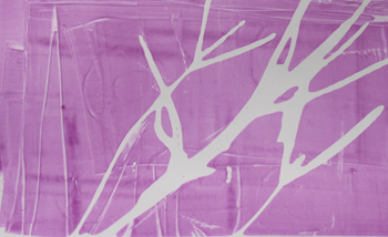
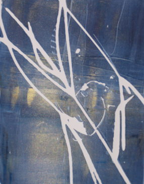
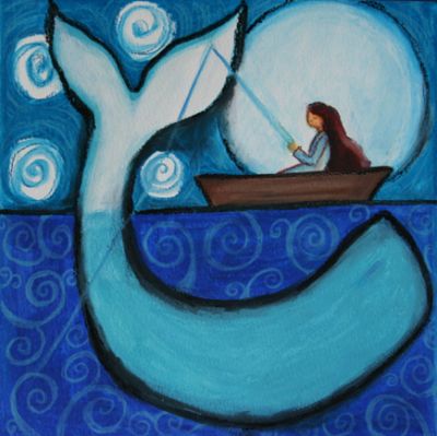
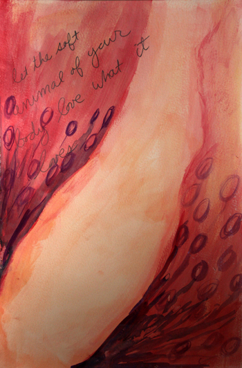
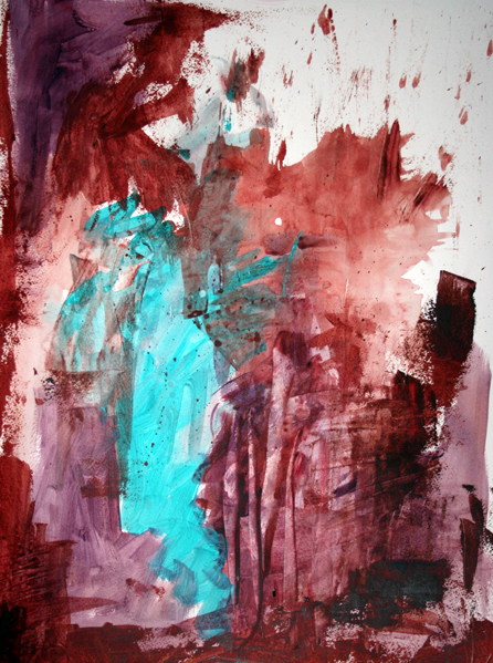
I ended up using different parts of the poem to inspire the three different pieces I was working on. Each piece below was inspired by the lines above it:
the world offers itself to your imagination,
calls to you like the wild geese, harsh and exciting —
let the soft animal of your body
love what it loves.
Meanwhile the sun and the clear pebbles of the rain
are moving across the landscapes

They're all quite different! None of them feel complete really, but it was fun to play with color and layering and different ways of approaching a painting inspired by poetry.
I've got much to do and much more to share with you, but for now, do check out my interview at Pecannoot!! And a huge thank you to Jess for inviting me to be the first ever interviewee on Pecannoot! What a treat!
Intuitive Art and Committing to your Creativity
April 7th, 2009, Comments (26)
Last night I attended the first of a series of Intuitive Painting classes I signed up for. Before the class started, I received an email from the teacher saying that the first class was going to be all about color. I laughed at the synchronicity of it, considering this month's theme for the Creative Every Day Challenge is color!
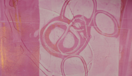
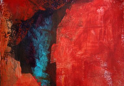
The first class was a feast for the senses. Each student was given a packet with a scent in it and then we were asked to create a color based on that scent. Mine was a yummy spice and the color I created was a warm reddish-brown. We all shared our colors and then used our color, along with the color of a classmate, to simply play with paint. I let my paint drip and run at first. We painted very quickly, so each of these pieces could be developed with further (all except the one directly below are 18"x24") or used as the beginning of a painting later on. The idea in moving quickly is to kick out the inner-judge and get painting, to try new things, to experiment. The first piece (below), created something that looked a bit like a face.
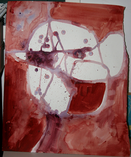
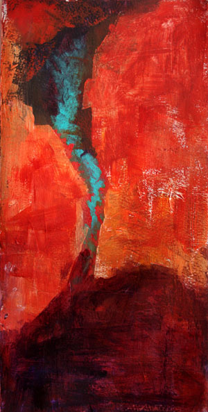
In the next piece, we used the first two colors, plus one more. The result of that one is the first image in this post. It was fun to play, to splatter, spray, scrape, and smoosh paint and just see what happens. In the next piece, we added one more color, using something a little unusual for us. I don't use a lot of yellow, I tried adding that to the piece below.
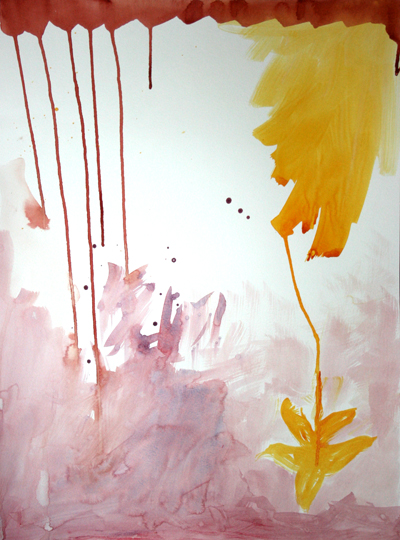
We quickly moved on to the next, where the teacher encouraged us to paint with colors that we have a strong feeling for (like or dislike). I'm not a big fan of pink (I paint with it pretty rarely, so I just went nuts with the pink paint and added some yellow too.) As you can see, Emma especially liked that one.
It was a fun class and I'm looking forward to doing some more playing next week!
One thing that's great about signing up for a class like this, is that it gives you a set time each week, when rain or shine, you're going to honor your commitment to create. And yes, signing up and paying for it is helpful in getting me to actually show up at the specified time and place. How do you make commitments to your creativity? Here are some of the things I do:
*I participate in challenges (like the Creative Every Day Challenge) to help keep me focused.
*I get support (like my wonderful coach, Kathy who just started her own blog!).
*I take classes, online and in-person.
*I show up to create even when I'm not feeling inspired.
*I schedule time for creative projects I want to see fulfilled (literally picking days and times and putting them in my calendar!)
*I take time off to rest and re-fill the well. (We all have creative cycles.)
*I ask for help when I need it. (This one can be hard for me, but I'm working on it.)
*I find inspiration everywhere.
*I use a theme word for the year (Leap!) and keep it posted in front of my desk to remind me.
How do you commit to your creativity?
p.s. One of the reasons I started offering Art Picnic teleclasses was because I know that having a set time on your calendar to focus on creating is incredibly helpful in maintaining a creative practice. Want to make a date with your creativity? Join us on the 25th for the next Art Picnic workshop!
Colorful Poems
April 3rd, 2009, Comments (17)
Our way begins on the other side.
Become the sky.
Take an axe to the prison wall.
Escape.
Walk out like someone suddenly born into color.
Do it now.
~Rumi
April is National Poetry month. I love the idea of playing with the Creative Every Day Challenge's theme of color and poetry. How could you mesh the two?
You could:
*Write about yourself as a color, as in "I am blue. I am soft, ethereal, just-woken."
*Write about how a color feels, how it smells, and tastes.
*Paint a wash of your favorite color in a journal and write the lines of your favorite poems over it.
*Play with writing a poem in color, mixing the words with what colors you imagine them to be.
*Turn your head to the right, what's the first color you see? Right a poem about it.
*Use a colorful photograph as the jumping off point for a piece of poetry.
*What is your least favorite color? What is it about that color that you dislike? Write free-form style about it.
*Read a favorite poem. Does it seem to reflect a certain color for you?
*What childhood memories does the color red bring up for you? Let that be a starting point. Red makes me think of my sister's stained t-shirts, popsicles in summer that turned our tongues red, the choke berries in the woods that made me wonder if they really did make a person choke, the red jumpsuit I was wearing the day I got my first period.
Color can hold so many associations, so many memories. Where do those color memories take you?
For more poetry goodness, check out:
*Resources for writing poetry with kids
Red bird came all winter
firing up the landscape
as nothing else could.
~Mary Oliver
And I couldn't resist sharing...more Mary Oliver below...
(more...)