Drinking up Color Online and Offline
April 15th, 2009
Yum. Something about color is so delicious to me right now. I'm just drinking it up. Between the Intuitive Painting class I'm taking, the fact that Spring is finally happening here in New England, and this month's theme for the Creative Every Day Challenge, I'm all about color.
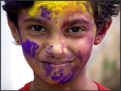
One of Sukanto Debnath's photos of Holi, Festival of Color
If you're in need of a shot of color, get yourself over to the Colour Lovers blog. They have fabulous articles with stunning pictures sure to inpire you. I'm loving this one about Holi, the Hindu Festival of Color that happens in March, and this one about the colorful art of Thangkas.
Speaking of Thangkas, I had the pleasure of meeting Leslie Rinchen-Wongmo at a Christine Kane retreat last month and she makes absolutely amazing pieces of textile art working in a Tibetan tradion. Her fabric thangkas are sacred Buddhist images created in layered, hand-stitched silk. Wow, beautiful stuff. Leslie has a blog and she's on Twitter too!
Do you ever notice the colors that are prevalent in the places you travel to? Something about traveling to a new place makes things like color really pop for me. Even if we're unable to travel at this time, we are so lucky to be able to view colors from all over the world online. This site explores color all around the world and wow, it is so inspirational. Or you could just go get lost in Flickr, searching for random words.
What colors are you drawn to as you look around online and offline? Make notes in a sketchbook and later use oil pastels, colored pencils, collage, paint, or crayons to play with your chosen colors.
Or try this: Flip through magazines and without thinking tear out any color that catches your eye. Don't focus on the objects, just the colors, textures, and patterns. Spend at least 5 minutes tearing, then put all your images out in front of you, and make mini color palettes. You can use a glue stick to glue these color palettes into your journal or onto 5"x7" cards (old postcards work great for this). This can be a great jumping off point for some artwork (either painting over the magazine images or recreating your color palette in another media.)
Go soak up the color. I can't wait to see what you create!


14 Responses
Another good place to soak up color? The paint section at your local hardware store. I’ve been asked to do a whole batch of paintings for a vacation rental in Hawaii. I stopped by to pick up samples of the wall colors they are using to help me in choosing colors for the paintings and WHOA, I got lost in the sea of beautiful, bright, bold hues!
I ended up browsing them for an hour, grabbing samples, looking at this color with that color, and just playing with the combinations. I think I’ll be trying some of your suggestions with the paint samples I took.
Posted by: Julie | Apr 15, 2009 at 6:55 pm |
Thank you for sharing such simple, *achievable* ideas to get creative with color! Between your gentle encouragement and the gorgeous pictures of Holi over on ColourLovers, I feel lighter and happier and inspired to play with color. Yay!
Posted by: Victoria Brouhard | Apr 16, 2009 at 1:00 am |
This is so completely gorgeous
I adore the links!
For some reason, I get really obsessed/inspired by colour combinations ~
like http://www.colorcombos.com/
Posted by: Goddess Leonie | GoddessGuidebook.com | Apr 16, 2009 at 1:51 am |
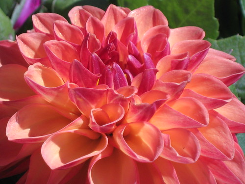
That flower says ‘rejoice.’ Uplifting. Holi sounds like a blast.
Posted by: Shayla | Apr 16, 2009 at 9:54 am |
Always inspiring and fun–hope to check this out! SOON! YAY! Fun pix and links.
Posted by: Mary Stebbins Taitt | Apr 16, 2009 at 12:31 pm |
As always thanks for sharing the most interesting things. You give me food for thought and ideas for projects.
Posted by: Leslie | Apr 16, 2009 at 2:53 pm |
Excellent resources, thank you! I’m right now in the process of trying to decide on wall colors for a bunch of rooms in my (new to me) place… will have to try the magazine exercise and see what I come up with
Posted by: Eileen | Apr 16, 2009 at 5:50 pm |
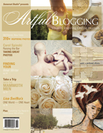
Hi Leah! I just blogged about color today too! You can read it at http://treasures-found.blogspot.com. What a coincidence about the color – great minds must really think alike ….and I just got my issue of Artful Blogging…what great exposure for the wonderful things that you do for all of us, inspiring us to greater creative heights no matter what our chosen medium. And thank you so much for the opportunity to have my jewelry featured in the magazine right alongside those other gorgeous works of art. Funny enough, I was wearing that same piece of jewelry today. Must be my “something good” today! Enjoy the day! Erin
Posted by: Erin Prais-Hintz | Apr 16, 2009 at 7:43 pm |
Colour! Yum!
And speaking of noticing the colours in the places we travel to – it’s amazing to notice how the light changes and interacts with the natural colours of a place.
When I’ve been overseas and returned to Australia (and other Aussies have mentioned this to me as well) there’s a kind of saturated, crispness to everything. The blue in the sky casts its magic over everything.
I’m sure each country, or continent at least, has its own special colour cast
Posted by: Rebecca Leigh | Smart Fresh Writing | Apr 17, 2009 at 4:42 am |
I, for one am addicted to color. I have fabrics groups together in palettes in my studio and really do not want to disturb them making a quilt or anything else with them. Pathetic, but I love how they are arranged on the shelf. The shelf is opposite the door as I walk into the room. I feel energized just looking at it.
Posted by: Leslie Randle | Apr 17, 2009 at 6:00 pm |
If I can’t get to a garden to soak up color, then a fabric store is a good place (even though I don’t sew!) or even a drive to check out signage around town.
When I moved to Los Angeles I was absolutely struck by all the bold colors on the street — bright clothing often with patterns and lots of sparkly bling, bright awnings, bright signage, bright billboards, bright shop windows, bright trim colors, flashy cars, lots of flowers, noisy people and music on the street and in cars, decorative lighting, crazy architecture, brilliant sky and ocean, even the boldly painted taco wagons and the little food carts full of fresh tropical fruits with wild sun umbrellas, and on and on, a surprise around every corner saying: “Look at ME!” … Maybe the set designers and all the different cultural influences have melded together to create such a rich,sensory-stimulating scene?
When I moved to Portland, I was struck by the stillness and lack visual energy. Barely any discordant color — predictable brick,stone or tasteful beige buildings, industrial look of an older city, clothes tend to be muted or neutrals or just dark…. such a contrast. I suppose the light (or lack of it) has something to do with it, too, but there is just a whole nother visual vibe going on here.
Fascinating.
Posted by: Barbara Martin | Apr 17, 2009 at 9:04 pm |
Can you please add me; it has been awhile since I visited but now have you added to google reader and that is going to make it so much easier! I really like the themed concept.
Posted by: AscenderRisesAbove | Apr 18, 2009 at 9:41 am |
I really do love colour…right now I am waiting for gobs of it to dry so I can add more on one of my paintings! It takes a few days for almost an inch in places of paint to dry! I originally started painting in oils…but they took years…so I moved to acrylics!
I just wanted to say thank you for the picture of the paint covered girl celebrating Holi…that led me on a wonderfully enjoyable journey of colour looking up all about Holi…
In fact this whole post caused many delightful blog wanders and researches…
Posted by: Tamara Campbell | Apr 18, 2009 at 5:06 pm |
Leah… Yes, color is so transforming, isn’t it? I didn’t know that unti I started making my mandalas..which are booming and blooming with color! There’s a definite dance and rhythm to this color vibe..for sure! Thanks for sharing all the wonderful links!
Posted by: Cheryl @ Mandala Oasis | Apr 20, 2009 at 5:02 pm |